Applying CSS in HTML/JavaScript
CSS code can be used in multiple ways in web browsers, and most of them are supported in WebF.
Applying CSS in HTML
Using CSS via <link /> element
CSS code can be downloaded and applied to your elements with <link /> element, which is a popular way to apply CSS in
web pages.
Example
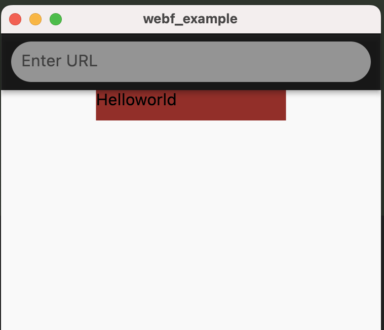
If we have a style.css files that contains the following CSS codes:
 :root {
    --main-bg-color: brown;
    --main-width: 25vw;
    --size-ratio: 2;
}

.container {
    width: calc(var(--main-width) * var(--size-ratio));
    height: 30px;
    margin: 0 auto;
    background: var(--main-bg-color);
}
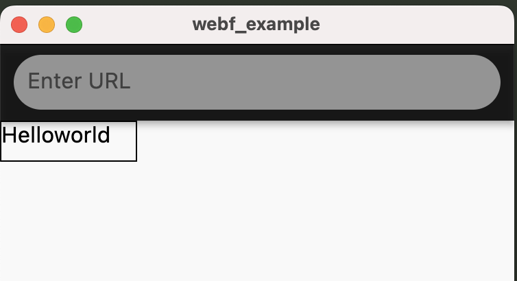
You can load this css file using the following codes:
<!DOCTYPE html>
<html>
<head>
    <link rel="stylesheet" href="./style.css">
</head>
<body>
<div class="container">
    Helloworld
</div>
</body>
</html>
That HTML will be the following result in WebF and acting the same as in web browsers:
Using CSS via <style /> element
CSS code can be embedded into HTML directly via <style /> elements, without send a network request for downloading.
The previous example can also be implemented by the following codes.
<!DOCTYPE html>
<html>
<head>
    <style>
        :root {
            --main-bg-color: brown;
            --main-width: 25vw;
            --size-ratio: 2;
        }

        .container {
            width: calc(var(--main-width) * var(--size-ratio));
            height: 30px;
            margin: 0 auto;
            background: var(--main-bg-color);
        }
    </style>
</head>
<body>
<div class="container">
    Helloworld
</div>
</body>
</html>
Apply styles with inline style
Inline styles are also supported in WebF, and they have a higher priority than styles from <style /> and <link />
elements.
In later chapter, we will delve into more details about the cascading support of CSS in WebF.
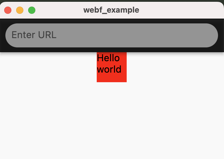
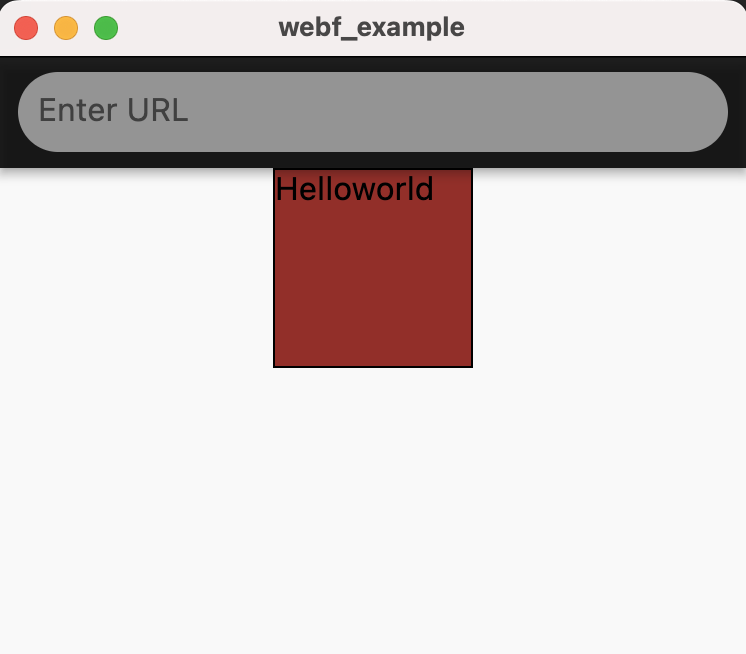
Here is an example demonstrating how inline styles overwrite the styles defined in a <style /> element:
<!DOCTYPE html>
<html>
<head>
    <style>
        :root {
            --main-bg-color: brown;
            --main-width: 25vw;
            --size-ratio: 2;
        }

        .container {
            width: calc(var(--main-width) * var(--size-ratio));
            height: 30px;
            margin: 0 auto;
            background: var(--main-bg-color);
        }
    </style>
</head>
<body>
<div class="container"
     style="
      width: 50px;
      height: 50px;
      background: red;">
    Helloworld
</div>
</body>
</html>
And here is the results in WebF:
Applying CSS in JavaScript
Update styles in Vue.js
Most of the time, it's not necessary to manipulate the DOM properties directly.
If you're using Vue.js, you can refer to this guide and let Vue.js handle these tasks for you.
Update styles in React.js
React.js is also supported, you can refer to this guide for more details.
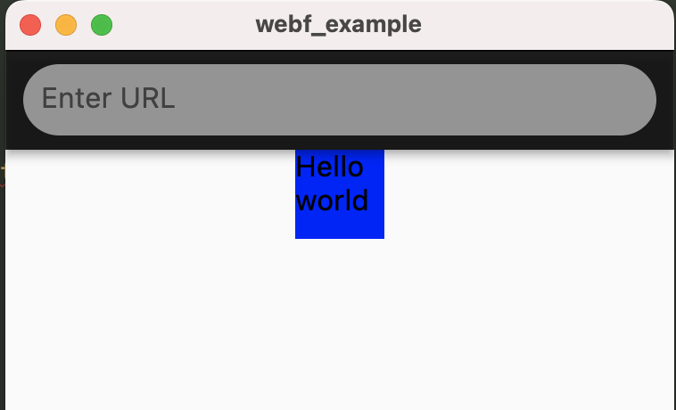
Setting inline styles via DOM API
You can use the style property from the HTMLElement to set inline styles for that element.
Example:
<!DOCTYPE html>
<html>
<head>
    <style>
        :root {
            --main-bg-color: brown;
            --main-width: 25vw;
            --size-ratio: 2;
        }

        .container {
            width: calc(var(--main-width) * var(--size-ratio));
            height: 30px;
            margin: 0 auto;
            background: var(--main-bg-color);
        }
    </style>
</head>
<body>
<div class="container">
    Helloworld
</div>
<script>
    const container = document.querySelector('.container');
    container.style.width = '50px';
    container.style.height = '50px';
    container.style.background = 'blue';
</script>
</body>
</html>
And here is the results in WebF:
Switch className to toggle styles
You can change the class attribute of an element using either the className or classList property. This will, in turn, alter the CSS rules that apply to that element.
Example
This example will change the styles of the box after tapping the screen.
<!DOCTYPE html>
<html>
<head>
    <style>
        :root {
            --main-bg-color: brown;
            --main-width: 25vw;
            --size-ratio: 2;
        }

        .container {
            width: calc(var(--main-width) * var(--size-ratio));
            height: 30px;
            margin: 0 auto;
            background: var(--main-bg-color);
        }

        .big-container {
            width: 100px;
            height: 30px;
            border: 1px solid #000;
        }
    </style>
</head>
<body>
<div class="container">
    Helloworld
</div>
<script>
    const container = document.querySelector('.container');
    document.body.onclick = () => container.className = 'big-container';
</script>
</body>
</html>
That box should display the results when you tapped the screen:
Here is another example using the classList
property to adding multiple class property for an element.
<!DOCTYPE html>
<html>
<head>
    <style>
        :root {
            --main-bg-color: brown;
            --main-width: 25vw;
            --size-ratio: 2;
        }

        .container {
            width: calc(var(--main-width) * var(--size-ratio));
            height: 30px;
            margin: 0 auto;
            background: var(--main-bg-color);
        }

        .big-container {
            width: 100px;
            height: 100px;
            border: 1px solid #000;
        }
    </style>
</head>
<body>
<div class="container">
    Helloworld
</div>
<script>
    const container = document.querySelector('.container');
    document.body.onclick = () => {
        container.classList.add('big-container');
    }
</script>
</body>
</html>
That box should display the results when you tapped the screen:
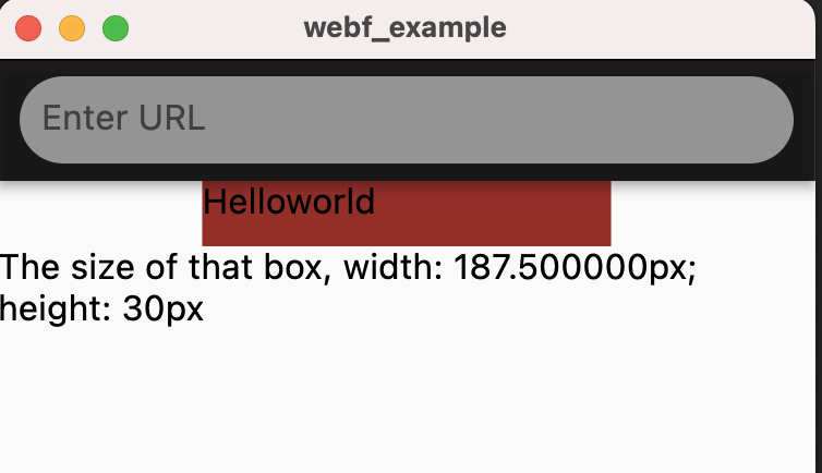
Getting the computedStyle from elements
WebF also gives you the Window.getComputedStyle API to read the values of all CSS properties for that element, after applying active stylesheets and resolving any basic computation those values may contain.
Example
<!DOCTYPE html>
<html>
<head>
    <style>
        :root {
            --main-bg-color: brown;
            --main-width: 25vw;
            --size-ratio: 2;
        }

        .container {
            width: calc(var(--main-width) * var(--size-ratio));
            height: 30px;
            margin: 0 auto;
            background: var(--main-bg-color);
        }

        .big-container {
            width: 100px;
            height: 100px;
            border: 1px solid #000;
        }
    </style>
</head>
<body>
<div class="container">
    Helloworld
</div>
<div id="result">
</div>
<script>
    const container = document.querySelector('.container');
    document.body.onclick = () => {
        const computedStyle = window.getComputedStyle(container);
        const result = document.querySelector('#result');
        result.textContent = `The size of that box, width: ${computedStyle.width}; height: ${computedStyle.height}`;
    }
</script>
</body>
</html>
This example will print the computed style size of the box when you tap the screen.